
The Godfather – Francis Ford Coppola

Flash Gordon – Mike Hodges

Invisible Man – James Whale
Creature from the Black Lagoon – Jack Arnold

Die Hard – John McTiernan

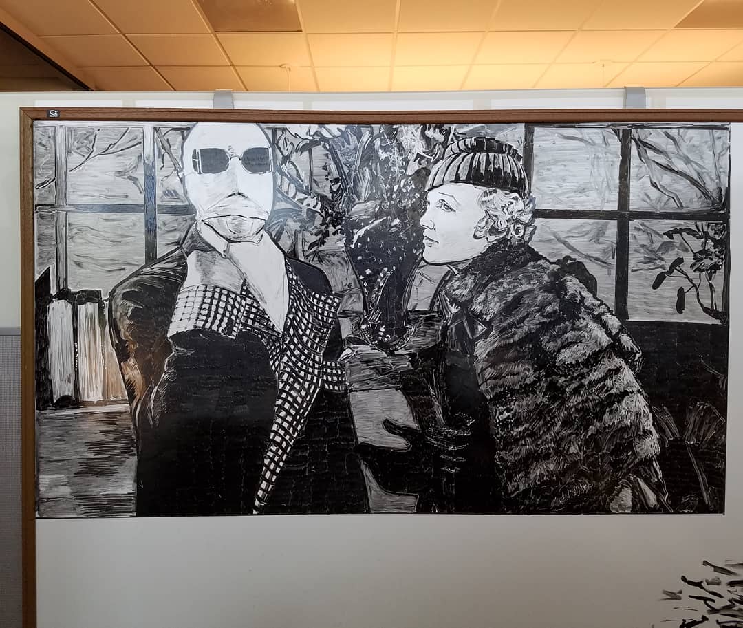
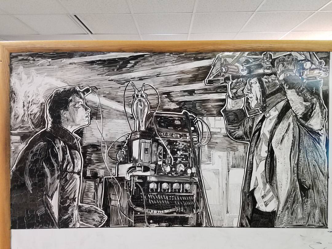
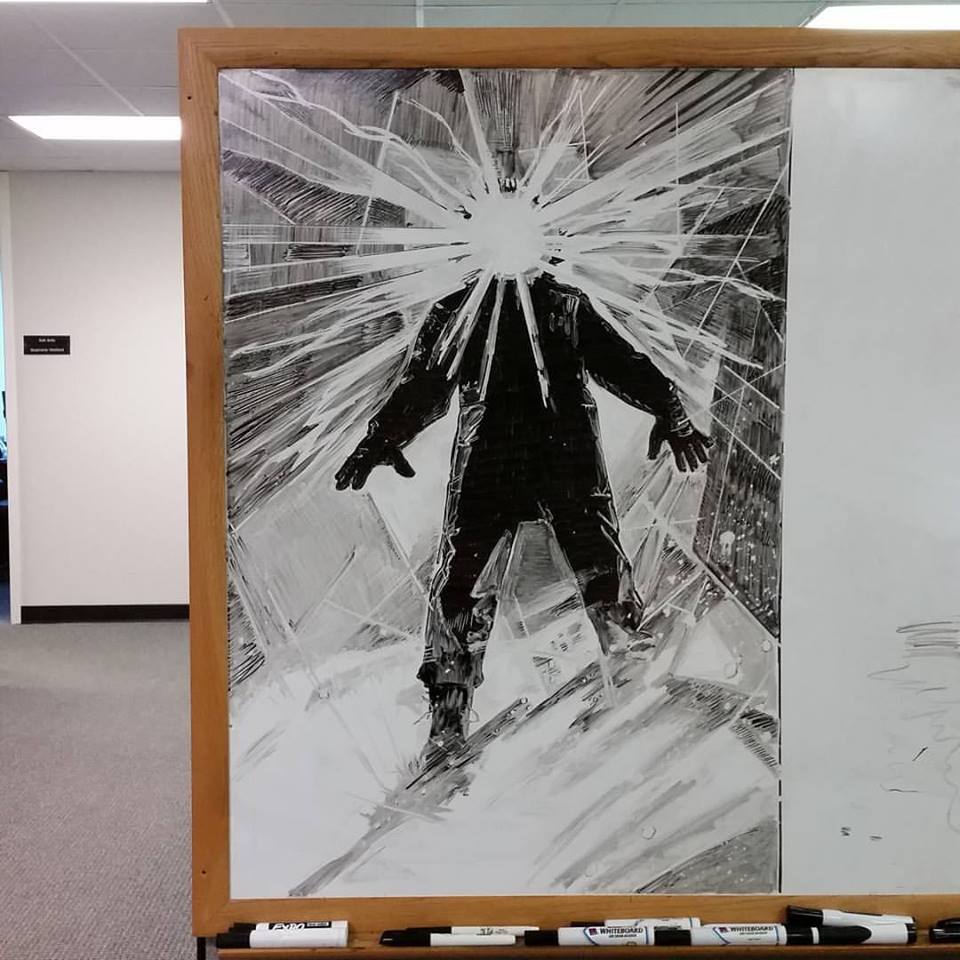
They Live – John Carpenter

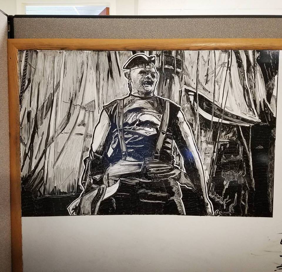
Tombstone – George Cosmatos, Kevin Jarre

Superman II – Richard Donner

Hellraiser – Clive Barker

Gremlins – Joe Dante

The Matrix Revolutions – Lana and Lilly Wachowski

Pan’s Labyrinth – Guillermo del Toro

Alien – Ridley Scott

The Goonies – Richard Donner
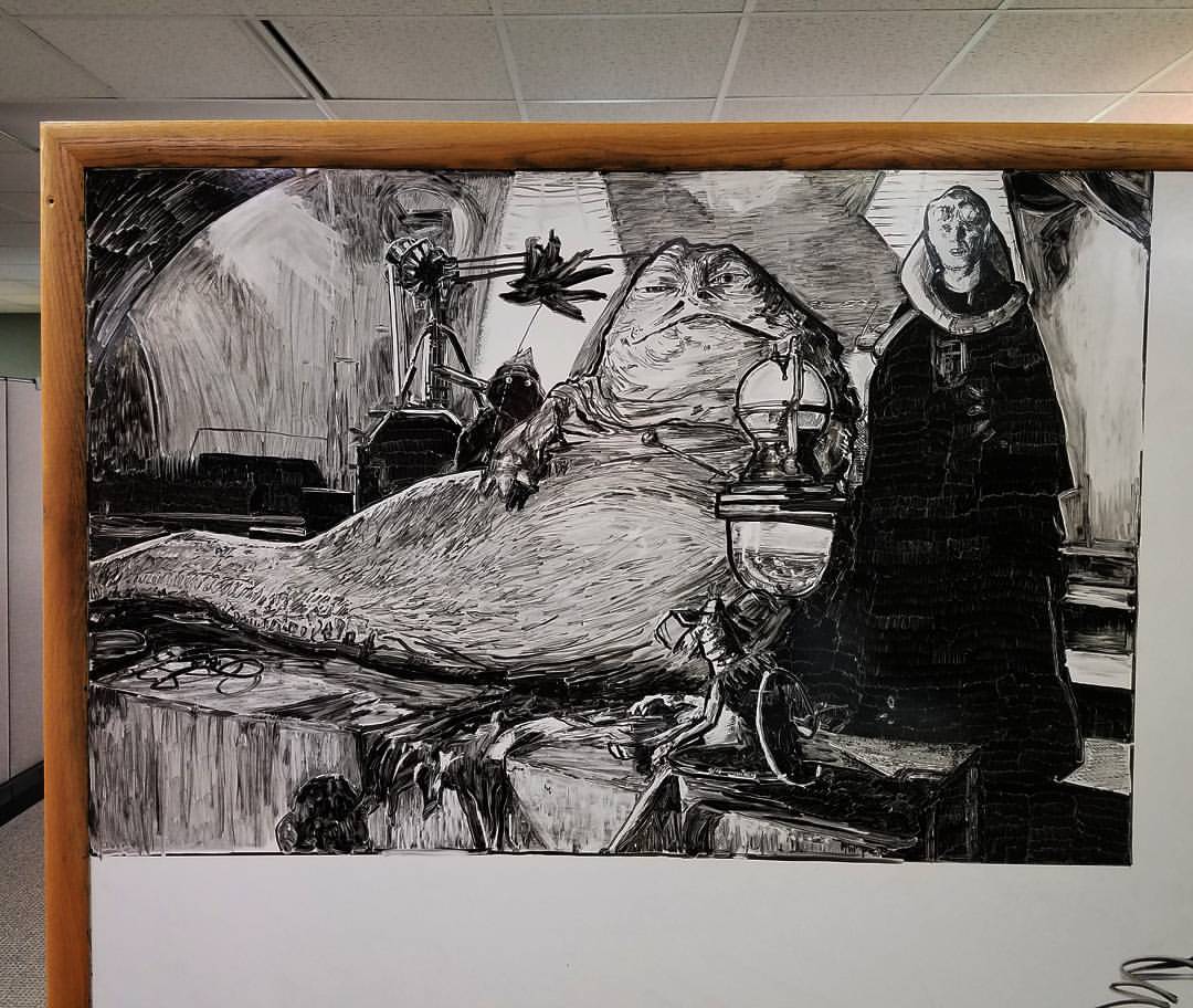
Return of the Jedi – Richard Marquand
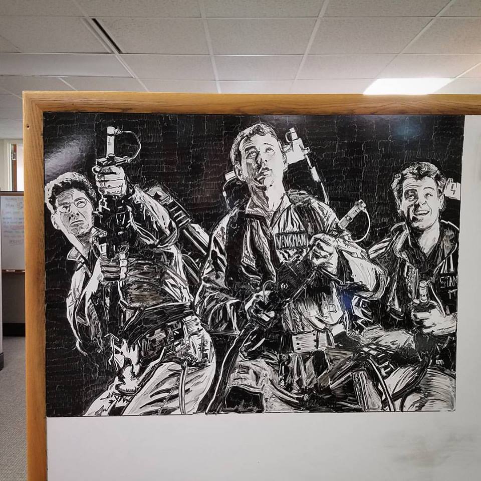
Ghostbusters – Ivan Reitman
Back to the Future – Robert Zimeckis
The Princess Bride – Rob Reiner
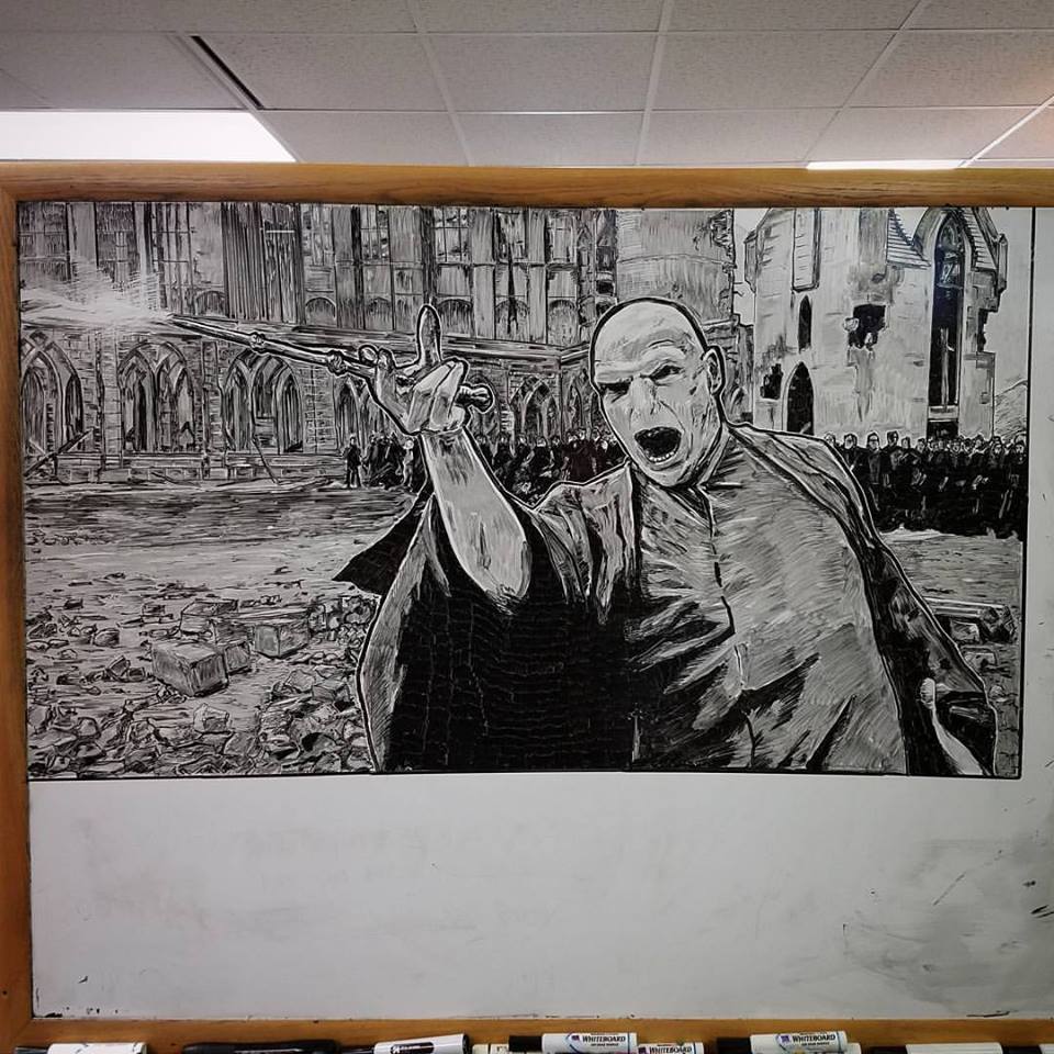
Voldemort – J.K. Rowling
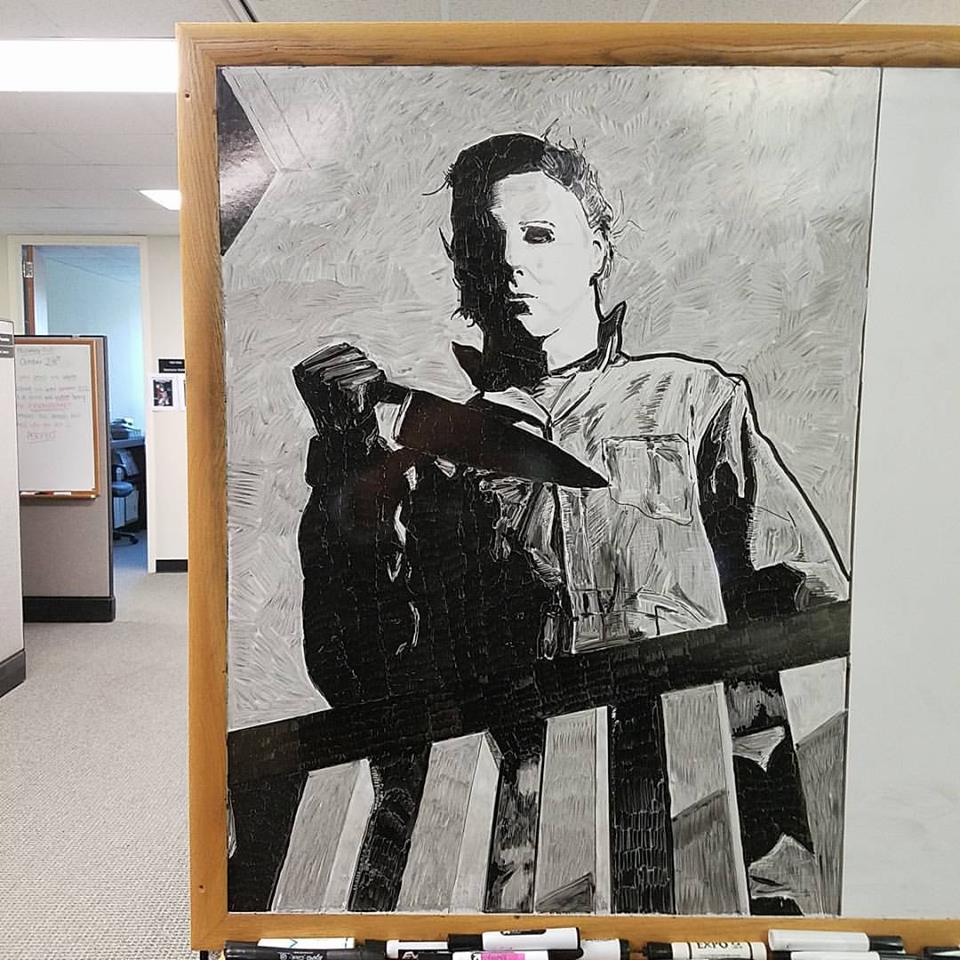
Halloween – Dir. John Carpenter
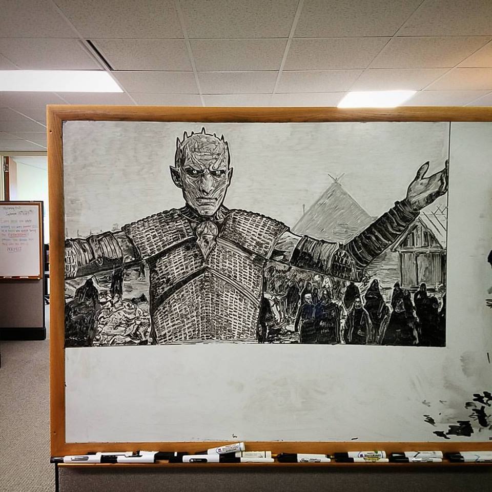
The Night’s King – George R.R. Martin
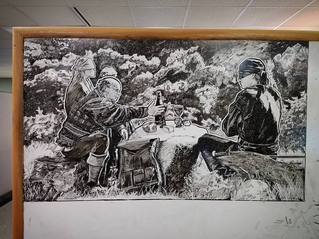
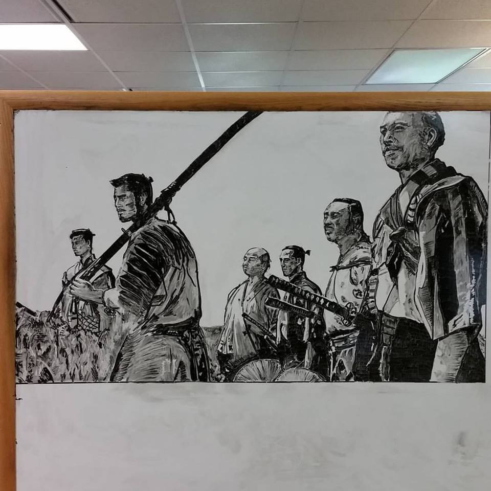
Seven Samurai – Dir. Akira Kurosawa
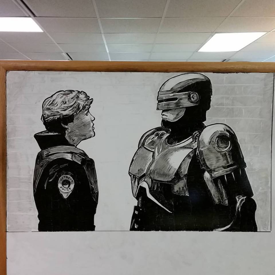
Robocop – Dir. Paul Verhoeven
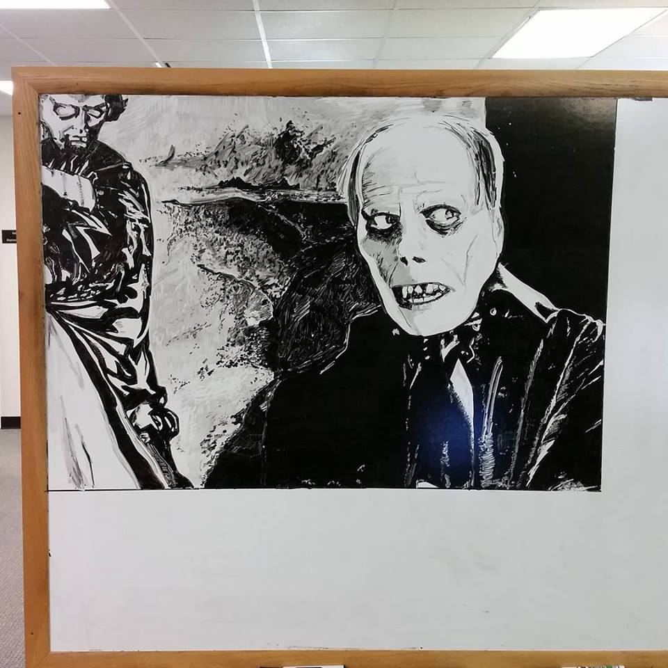
Phantom of the Opera – Dir. Rupert Julian
Legend – Dir. Ridley Scott
The Thing – Dir. John Carpenter
Big Trouble In Little China – Dir. John Carpenter

The Last Starfighter – Dir. by Nick Castle

The Dark Crystal – Jim Henson

Clash of the Titans – Desmond Davis

Raiders of the Lost Ark – Stephen Spielberg

Adventure Time – Pendleton Ward

The Nightmare Before Christmas – Tim Burton (dir.)

Bride of Frankenstein – James Whale (dir.)

Russian Landscape – Karl Schmidt-Rotluff

The Oath of the Horatii – Jacques-Louis David

Friendship Is Universal – V Science Fiction Series

Composition with red, blue, yellow – Piet Mondrian

Marvin The Martian and Duck Dodgers – Chuck Jones

2001: A Space Odyssey – Stanley Kubrick

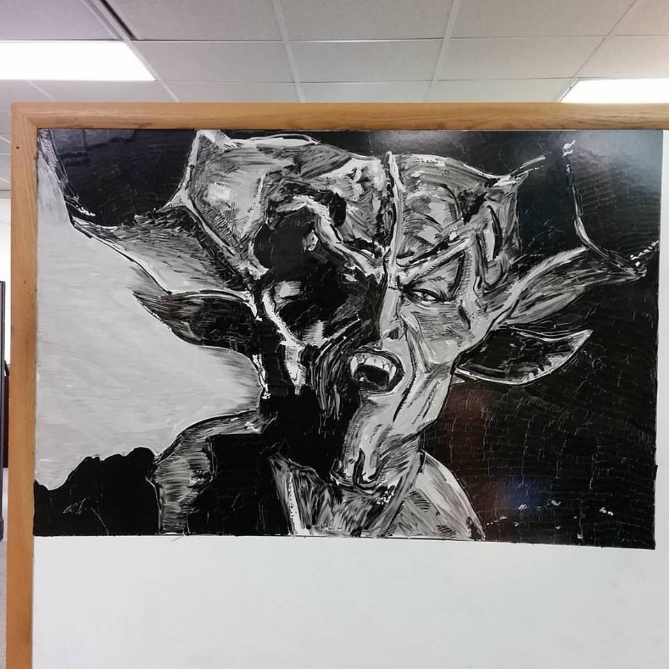
Labyrinth Goblins – Jim Henson

The Empire Strikes Back – George Lucas

The Blue Boat – Winslow Homer

Scarface – Movie Poster

Weta Digital – Gollum

Ben Edlund – The Tick

Pierre-Auguste Renoir – Luncheon of the Boating Party

Dragon’s Lair – Don Bluth

An Out-Of-Doors Study – John Singer Sargent

The Metamorphosis of Narcissus – Salvador Dali

Bar At The Folies-Bergere – Edouard Manet

Alice In Wonderland – Walt Disney/Sir John Tenniel

Jess’s House – Fatheart Galleries

Charlie Brown Christmas – Charles Schultz

La Discussion Politique – Emile Friant

Ballet Class – Edgar Degas

Iron Man 144 – Bob Layton

La Promenade – Claude Monet

Departure Of The Winged Ship – Vladimir Kush

Stop And Search – Banksy

Mountains – Ansel Adams

The Speech – Norman Rockwell

The Singing Butler – Jack Vettriano

Amants – Alphonse Mucha

The Cardplayers – Paul Cezanne

In The Car – Roy Lichtenstein

Nighthawks – Edward Hopper

The Great Wave Off Kanagawa – Hokusai

Guernica – Pablo Picasso

Relativity – MC Escher

Starry Night – Vincent Van Gogh

The Scream – Edvard Munch


Color me impressed. I didn’t know you were an artist…pretty sick one at that! And you do this at work?!?!
Thanks, mate. Yeah, for just a few minutes each day. The one I’m working on now I’ve been doing for a solid month. They take a while to finish, obviously, working in such little chunks.
That’s amazing. I want to say the Wave (can’t remember the work’s real name) is the best, except for what happened to Japan yesterday.
Barbara, the Wave is by Hokusai, titled “Under a Wave off Kanagawa”. It’s the first in his series of 36 views of Mt. Fuji — note that Mt. Fuji appears under the crest of the wave.
It was published during the Edo period, in the early 1830’s.
I think my favorite here is Rockwell’s, “Freedom of Speech”, closely followed by Hopper’s “Nighthawks”, but they’re all very nice!
Thanks for sharing them!
Thanks, Bob!
do you erase these? How does it feel to erase them? THere something very compeling about doing it in dry erase marker. Thanks!!
I do erase them… I thought it would be a little painful but really at that point I’m excited about starting the next one. At least I take pics of them. 🙂
You ERASE them?!?!?
Haha, yes I do. I only have the one whiteboard at work and there’s something a little zen about the impermanence of it. I’m working on a method of fixing them in place so I can do them for other people.
WOW! amazing. reevaluating what i do with my free moments…
Really dig the work and the details- the fact that each piece takes you so long is amazing as well.
I DO have on quick question, however- do you use a specific brand of Dry-erase markers? I use the round felt-tip one that came with my whiteboard and I find that even with patience and using such techniques as cross-hatch, pointilism and even dabbing with a tissue to remove excess ink for texture, it is still far too rogue for me to use effectively due to the varying bleeds of ink I get.
Should I splurge on the name-brand dry erase markers like Marks-a-lot or Expo? Also, if I may bother you with another question- do you have any tips on precision erasing? I find tissues work all right but I rather hate having my fellow coworkers think I am dying of Black Lung and get ‘talks’ concerning my disturbing health, el oh el.
Keep up the good work, I will be watching for more.
Hey Kirb-
Thanks for checking out the site! I have all different brands of markers but I do have favorites for certain things. Quartet Enduraglide is my favorite for a thick, flowy, dark black. They last a long time too.
For erasing, I keep a couple completely dead markers around with no ink in them so I can ‘draw’ my erasures. For my more precise erasing, and the irony is not lost on me, I use a pencil eraser. 🙂 That’s been the best tool I’ve found so far but it has to be a new pencil so the eraser has a sharp edge. When drawing detail, definitely go with a chisel tip marker. Angled the right way you can get REALLY thin lines. I did that whole Escher one using 2 chisel tip Marks-A-Lots. I’ve tried round and bullet tipped markers and they just didn’t do it for me.
The idea of it is reminiscent of a sand Mandala. You are great. I am linking up a storm.
Thanks, Holly! Link away!
nice!
Thanks!
Hello!
I want to let you know that I greatly appreciate what you do – mostly impressive and inspirational!
Your work has been featured on my blog, I hope that’s okay with you (of course, with source cited as your site!) 🙂
Keep up the great work!
Thanks for featuring my work on your blog and stopping by the site! I’ll try to keep them coming.
I was lead to your site by none other than Pee Wee Herman himself! He tweeted the link to your page here. Wow! Love the work! Back in the days when I worked in a cube environment I did a few drawings but nothing quite like this! Keep up the excellent work!
Haha, Pee Wee Herman? Are you serious?! Glad you enjoyed the blog and thanks for looking! I’ve just finished Emile Friant and I’ll post that one soon.
me too!!!! this is so great!
Thanks for checking it out, Leah!
I followed Pee-Wee Herman’s Facebook link : ) These are amazing! I wouldn’t be able to erase them.
Crazy! Thanks for stopping by Morella! As soon as the office starts supplying me with whiteboards I can keep I’ll start saving them. 🙂
Pee Wee lead me here too!! Your cubicle’s new name is cubicle-eee!! :)>
(seriously…..love your work.) I recognise some like ‘The Scream” and ‘Starry Night’ and the diner one I learned in Modern Art class but can’t remember now….others I recognise the style of the artist such as Banksy and Lichenstein but not necessarily the piece…did you make up the content but do it in their style? I see also Art Deco (that one’s my fav) and Ansel Adams maybe? And the boat with the butterfly sails….your creation? So amazing. I’d love more details!!
Hi Sugar-
These are all famous works… I originally just wanted to do homages to artists whose work I admire and also spread a little art knowledge around the office. As time goes on I plan on branching it into some different directions, like maybe some album covers, famous movie scenes and some original works of mine. The next one I plan on doing is a really quick version of the Charlie Brown Christmas Special. 🙂 If you go back through the blog you can read posts about each one as well. I need to go back and edit the finished works page to include the artists and title names. Thanks for stopping by and checking it out!
Pee Wee led me to you, also. These are wonderful! Working would have been more fun if I had had cubicles nearby filled with creative people. Your work reminds me of the dirty windshield art by Scott Wade of Austin, TX. I think you two must be kindred spirits. http://yourdailychum.com/2008/06/16/dirty-windshield-art/
Hi Suzy!
Yes, I think I would get along with Scott just fine. We do seem to be coming from the same artistic place… Thanks for checking out the site!
If you are ever in the market for a new whiteboard, visit the site of my family’s manufacturing company! http://www.vecchiomfg.com We’d love to see more of your artwork. It’s amazing! Still trying to figure out how you shaded so well….congrats!
Hi Sarah-
Thanks for the link! Do you by any chance have the unruled student whiteboards? I was thinking of doing some to sell.
As for the shading, I do all kinds of weird stuff to get it. Have your company make me a gray dry erase marker and save me some effort! 🙂
Wow. Your art is indead very good. Actually, I found my way here looking for a grey whiteboard marker. I don’t think they exist. I teach English to Speakers of Other Languages and find colour-coding what I write really useful. However, the range of colours is still quite limited. Grey would be so useful for writing parts of sentences which exist but which are not the focus of attention for a grammar point as is often the case for so-called prepositional phrases. Alternatively, I could write a sentence in grey and show bold in black. Come on stationers. Please make something dark enough to be seen but light enough to be distinguished from black. There’s a market out there.
Hi Andrew-
Thanks for your compliment! I don’t think there is a gray one either but that won’t deter me from continuing to look. 🙂
I am here for the gray, too. I am an avid whiteboard artist and love your pieces. I really need gray. My half-dried black marker does not write for long. I read through the posts here which were helpful. I am going to try and sacrifice another back marker to see if I can dry it out enough for gray. I wish I could achieve some of the effects you have. Quite remarkable.
For what it’s worth, the Marks-a-lot markers tend to die out best for me and give me the best grays.
It’s amazing what you can do with a whiteboard. Truly awesome stuff!
I work for a company called DrawTop (www.thedrawtop.com). We sell adhesive whiteboards for your laptop and we’d love to send you a free one if you are interested. All I need is the make and model of your laptop and an address to send it to. 🙂
Cheers!
Thanks, Jenny! You’re very kind. I went to the site and would love to try one. I’ll contact you via email.
Love your work! If you ever have the desire to work on a large scale we’ve got a few walls inside a building in Carrboro, NC that could use some art.
Which building? That’s really close to me.
605 West Main St. The four story building next to the Looking Glass Cafe.
I’ll have to swing by it, take a look.
That would be great! Let me know when you swing by, I would love to meet you. I work and live at the building so I am here most days.
Kristy
idealifd@msn.com
Swami, have you considered movie stills? I ‘d like to challenge you do a Road Warrior, Evil Dead Fear and Loathing still.
You read my mind! I actually have something like that lined up for the next one.
Holy crap, I wish I had time at work to do this too. The wave and the Iron Man cover were my favorites. Keep it up!
Get there five minutes earlier… 🙂
Glad to see the love for the Iron Man cover. The colors made that one tough.
You are an amazing artist! I’m blown away with what you’ve accomplished with a whiteboard and dry erase markers…
You’re very kind. Thank you.
What are some of your shading methods?
I try a few thigs like crumpled paper being pressed into the surface to give a little “texture” to some of mine.
My drawings are not as refined as yours.
However I know how you feel about erasing them.
It is a gateway to a new drawing.
I’ll have to try that method. I do tons of hatching and smudging with my fingers. Because it takes me a long time to do these, I can actually get some interesting effects after the marker has dried for a few days.
When do you have the time to actually work!
Great job, by the way.
I only touch these for about 5 minutes a day so I have plenty of time for work. 🙂 It usually takes me between 1 and 2 months to finish one.
That’s impressive man. I hope you consider doing work in some other format that is more permanent. I’d also think it would be neat if you did your own compositions. Clearly you have some talent. Either way Bravo.
Hi, Steve-
Thanks for checking out the site! I do plan on doing some of my own soon but they require a little extra planning. I also do comics work and am getting into some more traditional stuff. I’m also in a band so my free time is pretty scarce but I’m headed in that direction.
Awesome stuff indeed 🙂 such a shame they get rubbed out, these should go on exhibition.
Thanks, Kevin! I feel like the fact that they get erased is part of the charm but it severely limits my ability to do exhibitions. 🙂
I cannot express how absolutely cool this is. You, my friend, are a very talented artist. What a great way to liven up the cubical!
Thanks, Rowan! Gotta do something to make those walls interesting. 🙂
Absolutely amazing! Do you sketch them out on paper before for you start with the dry erase makers?
No, usually I just print a copy off google images so I can have some reference. 😉
This is…beyond awe-inspiring…. I am an artist with Asperger’s Syndrome (mild autism) and Major Depressive Disorder, basically I am a social disasterpiece in civilian terminology. I would be both humbled and honored if you would take the time to talk with me by email or through this site, about this unbelieveable form of art. I am an artist who appreciates the soul and magic of artistry more than the time tested hyperrealism approach that many are taking these days…but I must say, your work is a pleasant mix of both, enough realism to impress, enough spirit to hold viewers hostage by their eyes. If you are interested in mutual artistic learning, please, do not hesitate to reply, your quiet brilliance in artistry fascinates, and you mentioned the ‘zen’ of erasure… not only am I dabbling in plexiglass dry erase art, but I am ALSO a decent sumi-e or Chinese brush painting artist, zen is a huge factor in my art form. If you can find the time to share some tips, tricks, secret art stuff, and knowledge in general, I would be more than glad to do the same. You seem like a very nice dude from what I read of your past, gracious comments, which is why I took the leap to contact you.
Well…I hope to hear from you, Mr. uh…Cubicleism? Thank you for taking the time to read this through. I really appreciate it.
David
PS. I am a peer leader in a group for people with Autism Spectrum Disorder called Asperger’s Alliance Delaware. We, as in, I, am making artwork for the upcoming Transition Conference, where I will be (very nervously) presenting a speech and more. Could I, with all due reference and documentation, feature some of your whiteboard homages to famous artwork at that conference?
It might get you some serious notice from seriously big corporations that attend the conference.
Thank you, regardless, and forgive the lengthiness of this comment, I talk a lot. Peace.
What an incredibly nice comment! I’ll contact you through the email you attached to the comment.
I do dry erase art as well….such a great medium.
Oops got email wrong
It is, and underrated! Do you post yours anywhere?
This page is awesome! I love white board art. Just tweeted it to my followers! Hope you keep updating it.
Thanks for spreading the word, Tom!
I am actually searching for grey dry erase markers. Do you have any leads? You are one of the first posts to show up, and I thought maybe you would have a lead.
I’ve searched high and low and had no luck. I have a specific process for ‘killing’ markers to the grey I want. That’s as close as I’ve come. If you do find a grey one, do let me know. 🙂
I like this weblog so considerably, saved to my bookmarks. aedckedbkkad
Amazing work! Dry erase boards are not an easy medium but you’ve certainly mastered them!
Thanks! It is a very tricky medium but surprisingly versatile once you get the hang of it. I find that each one I do teaches me something a little different.
You mentioned that you have some tricks to get the shading you want. Care to share any? I am a teacher, and at the end of the year, I often do dry erase pictures on my board for my students during finals week (since I no longer need the board). The pictures I have done are mainly single character drawings with no background, and they are done with solid black and white. I have made some where I can use color markers where I just use different shades of a particular color, but there aren’t that many color variations with dry erase markers, so I can only do simple color shading there (like anime style color shading). The pictures I get doing just that turn out pretty well, but I am super limited when I can’t figure out how to do real shading. I have tired fading the black using different fluids, none worked. I tried waiting till the black dries, and spreading it with a dead marker (and even still wet markers), and had very spotty luck with that. Not good enough to do real shading with. I want to make some pictures for my students that give it that little extra wow factor, and shading is the only thing I think that I could do to achieve that.
Hey Radley-
By far the best thing I’ve found is to use a marker until it’s near death. The Marks A Lot chisel tip markers seem to die “best” for me and it’s actually surprising how long one will last in that state. To get an easily spreadable gray I usually get one of the chisel tip markers and press down extremely hard on it so that the tip starts to flatten out. The tip will become soft and once it starts to lose ink you can get a nice wide gray stroke. I never throw away markers unless they are completely dead and don’t have a sharp tip. I let one brand new small extra fine tip marker dry out completely on purpose for fine erasing, hatching and highlights. Staples has these smaller chisel tip markers that have very sharp edges and are great for fine detail work. Depending on the shading or style of the one I’m doing at the time, I might use one of those for hatching, which the eye will register as shading from a distance. In the Raiders one I just did, the entire background is basically one marker that was on its deathbed and that illustration officially killed it. I was having to put real elbow grease into it to get any ink at all out of it but it was perfect for what I needed.
Hope that helps. I’d love to see some of the illustrations you do for them.
If I can find a way to get my pictures from my phone to online, I would be happy to show them. I don’t have a smart phone (a 27 year old still dragging his feet on that one), so my phone has no internet access. I took pictures and saved them on my dummy phone, and they are just stuck there until I have a way of getting them somewhere else. I suppose I could text it to a friend who has a smart phone and get it uploaded to my Facebook or something that way. I’ll let you know if I ever get them up.
Thanks for the advice. I’ll give that a shot. I assume that when you say you let the marker die on purpose, you mean you just left the lid off and let the tip dry?
I’ll leave the cap on but not closed all the way. If you take it completely off it’ll dry out very fast.
The gray is working okay for me. I just mainly need to practice the drying out process. A few of mine dried out too much, and few not enough. The ones that weren’t enough were gray like I wanted sometimes, then it would give me some random dark streaks. So just got to perfect that thing. I do have one obstacle that I am running into. On the parts where I have a LOT of solid black, I can’t really get it solid. It looks nice and dark when it is fresh, but as it dries, I see a lot of the streaked look. I notice that on yours, it does that too, so I assume there is just no getting around it completely. But any time I have a large area that is just black, I can’t seem to get any of it nice and solid like I see in quite a few of yours. I have tried buying fresh new EXPO markers, and it does look better, but nowhere near as clean and solid as what I see in yours. Best example of yours I see is the Bride of Frankenstein. The man problem is when I use my completely dried ultra fine tip marker to make erase for detail lines in the black, it is not so visible because of the all the lighter streak parts. Any suggestions on how I can get my black areas more solid when they dry?
The Staples Remax markers give me some of my better dark blacks. I try to keep the strokes very small and overlap them slightly to avoid having a lighter part of the stroke.
Impressive.
Have you already tried grey markers from Neuland.com?
I would prefer them darker and larger, but if I add a black line, they are OK.
Best regards,
Yoyo1er, roi des yoyos
No I haven’t but I’ll check into that. Thanks!
I use also the Neuland Art maker brush nib … the model delivered without ink … for white colour.
Did you ever try that grey marker from Neuland that Yoyoler suggested? If so, would you recommend it? Also, I did find a way to get my pictures to send. Before, I had no smart phone so no way to email the pictures I took (which were poor quality anyway). Luckily, some of my students who have smartphones took pictures and kept them. Once I finally caved and got a smart phone, my students emailed them to me. So I can show you the things I have done (again, I am still pretty new to dry erase board).
Also, another question on bleeding the chisel tip out. You said you pres down on it really hard to flatten the tip. Do you do this on the dry erase board or on a stack of papers or something of the sort? Would I be able to make my marker run out of ink faster if I let it drain by being pressed against paper for a while? And are there stores that sell Marks-a-Lot? The stores I try sell Expo or their own store brand. I can only find Marks-a-lot online.
No, I never tried it. I may at some point but I’ve reached a pretty good and predictable equilibrium with the current tools so I’ll probably just stick with these for a while.
For your question about the chisel tip, I try to press it hard while scribbling back and forth on the try erase board. When it does start to gray, each time you pick the marker back up it’ll be a little darker from the ink building up so I’d scribble a bit to weaken it some. There are stores that sell the MarksALot brand but you’re better off just getting a black set off ebay.
As always, these pictures and paintings(?) are amazing, each time I come across them I have to take a while to look at the amazing detail in each of them. I saw that you mentioned in the Raiders of the Lost Ark image that it was as close as you can find to a perfect movie, Bu I must suggest Back to the Future as one of my personal favourites.
As such I do suggest doing either the movie poster, which is one of the best I’ve seen designed, or one of the scenes such as when Doc and Marty nearly get run over before it first travels, or at the end with the delorean flying above the streets.
Great work, and I hope these go forward into the future, quite inspiring and I’ve just went and done one myself on a smaller scale (a copy of your Starry Night in fact).
Thanks! Back to the Future would definitely be on that list. I LOVE that movie. Perhaps I’ll do that next (after Seven Samurai). 🙂
Wow! These are beyond fabulous! I’ve learned so much in your answers in these comments as well, thank you! It’s nice to see the work of another dry erase enthusiast. (I really didn’t know this was a thing, lol) A friend sent me your link, as I post my own daily drawings from work too. (But on a window, and only when I have time) My drawings are related to some history or the day’s birthday’s. Some were works of art, others, not so much, lol. And since it’s in a pool area, I have the added problem of humidity degradation to deal with. I sometimes use plain crayola markers for color, but they’re not consistent and oftentimes run or spot.
As for gray, I find using a black crayola (washable school marker) in an area I want to be gray, letting it dry, then smudging it with a tissue to the proper gradient of gray works for me. If you let that dry, **sometimes** you can draw over top of that with regular black dry erase effectively-other times, it seems to catch on the dry erase marker tip and degrade it too quickly. Maybe the humidity has something to do with my inconsistent results. (And might work differently on an actual dry erase board also). And the fat tipped black crayons tends toward green, while the skinny tipped ones are different and tend to be more grayscale. Hope that gives you something to toy with.
Anyway, just wanted to check in and say BRAVO! (And yesss! to the subject matter also!!!!)
Thanks, Niki!
I like your idea for the gray, I’ll have to give that a shot. Do you have somewhere that you post your work? I’d love to see it.
I’m afraid the only place I post my stuff is on my personal fb page, which is set to private, but I’d be happy to let you take a peek. Drop me an email and I’ll send you the link. There are a few in particular I could point you to that show the crayola blending in particular.
Been a while since I looked here. You mentioned before that you would like to see some of the work I have done. Where can I send pics? But I still have one issue with the chisel tip markers. I find that I must be pressing too hard. When I am pressing them and going back and forward on the board to bleed it out to make it better for gray, the chisel gets pushed into the marker itself, and becomes hard to use, or even unusable 😛 I found that I have been using the cone tips because of that. Gray takes longer to apply because the cone tip is so much smaller, but it at least gets the job done. and pressing on it squishes the tip so it is kind of fluffy, which makes getting the gray nice and solid pretty easy 🙂
Hi Radley, you can send them to spinester@gmail.com
Your Robocop picture actually inspired me to do a Robocop picture my current ‘end of the semester’ drawing. Got a pretty solid start on it, and it is going pretty well so far.
A lot of students are suggesting a scene from Wall-E for next year. Wasn’t sure about it, but then I started looking at scenes from the movie. There are a lot of really beautiful scenes that could make pretty cool whiteboard drawings. I am really considering that being my one for the next Fall Semester.
I noticed that your more recent ones have something that isn’t as heavily used in some of your earlier ones. You are starting to do solid white outlines around the people, I assume to separate them more from the background. Pictures like your Bride of Frankenstein, Labyrinth, Gollum, Vader, and quite a few others don’t use this technique so much. Is this something that you just recently picked up, or is there something about the newer ones like the Princess Bride and Back to the Future that are different from the others that made you use this? The one I’m doing now is the second time I am incorporating a background, so knowing if there are times to do this or not do this might be helpful.
That white outline was born out of necessity on the Voldemort piece, it was really hard bringing that figure forward without it. A super bold black outline was a bit too much; the white one did the trick while still sitting in the picture comfortably. It really depends on the background and white it requires to pull it off. Right now I’m doing a Ghostbusters one with a black background that provides enough contrast that I probably won’t use the outline. The lighting will sort of handle it on this one.
Just to see if I go this right. If you have a dark and not so active background, you likely don’t need the white outline. But if the background is very busy and close to the same shade as the subject/s of the picture, you use the white outline?
If that is correct, I will not need to use the white outline for mine (I don’t think). The background is night time with just some street lights in the very distant back ground.
Radley- That’s correct. Because of the limitation of the medium, value changes can be difficult. If there’s enough contrast between your foreground figures and background, you won’t need it. A thicker bold black outline around the foreground elements also works in most cases. It’s a classic comic book art trick, varying line weights according to depth of field and light source. Foreground elements have thicker lines, background elements thinner lines to ‘push’ them further back.
I did not know that. As I mentioned before, I’m a science teacher, so not an expert in art technique. The only thing I can say I have a good knowledge in artistically is theatre stage makeup. For drawing, I just do what I think looks good, and if I can’t figure something out, I just ask around for tips (like now :P)
So about the white line. I am getting to a part of my current picture where I am wondering if it would be good to use it or not. If I were to take a quick picture and send it to you along with the reference picture, could you give your opinion on if I should use that or not? I don’t want to erase an outline in there, find out it wasn’t a good idea, and try to fill in the thin outline again. I tend to not have great luck putting in marks right next to black areas that have been dry for a while.
Sure, send it on over!
If you’re still looking for a gray dry erase marker, check out this: https://us.neuland.com/markers-more/neuland-markers/neuland-no.one-whiteboardmarker-round-nib-single-colours.html?number=&c=763
choose grey from the ‘select marker color’ drop-down menu. They used to have refill dry erase ink aswell but currently they don’t. Maybe they will again some day.
Btw. Great pictures!
That was the link to the round tip. They also have got chisel tip markers:
https://us.neuland.com/markers-more/neuland-markers/neuland-no.one-whiteboardmarker-wedge-nib-single-colours.html?c=763
I’ve seen these but have yet to try them. I feel like I have a good system at the moment but I could always use more tools. 🙂
So I started a new one fairly recently. Like your Voldemort picture, there is a large crowd in the background. I am sure I will need to use the white outline technique you explained to me earlier this year. Would you be able to give some pointers as to how you managed the people in your background? That is the main part that I am pretty concerned with. Because of that, I have been avoiding getting to that part of the picture. If it would help, I can send you a picture of the movie scene I am doing. I’m just looking for any tips, big or small, to help me get my head around it.
Hey Radley-
The way I did the crowd in that Voldemort picture was to block out the entire crowd in black first, then go in and add details by using a ‘deader’ marker on top of the black. It basically replaced the deep black with more of a gray, giving some shading. Lastly, I went in with a totally dead ultra fine tip marker and erased in highlights.
Thanks for the response. Looking at a black and white version of my picture, I could see that being a useful technique. The main difference between the crowd in my picture and yours is that mine are not wearing black robes. It is a Gladiator scene, so there are mixes of different colors of robes/togas. Do you think that would be any issues trying it the same way? If your email hasn’t changed, I can always send the image I am using.
And figured I would share something I use. I do tend to use completely dead ultra fines to erase some details. But sometimes, I looked for something that is even sharper for really fine details, but won’t scratch my board. Toothpicks have become a really good friend of mine when I need very precise erases. Really helps for texture things like hairs, scratches on metal, reflection glares on windows, etc.
Hi Radley-
The address is the same if you want to send the picture over. The toothpick is a good idea, I use mechanical pencil or a thumbtack sometimes depending on how minute I want to get with the details.
Color me impressed, art me delight. How can I thank you not realize? just amazing art hand. Why not you add a video? Are you have any youtube channel?
Hi Stephen-
I don’t have a youtube channel, mainly because I do these only a few minutes a day in my cube at work. I work in a cool place, don’t want to push it by setting up a film shoot. 🙂
Working on another one at the moment? If not, you got one in mind. Thanks for the tips you gave for the background problem I was having last school year, by the way.
Hi Radley-
I am working on one at the moment for They Live. I usually post work-in-progress pics to my instagram and twitter if you want to see the process…
https://twitter.com/spinester
https://www.instagram.com/spinester/
I’m trying to branch out a little on my upcoming one. Goal is to have it done in about 4 weeks. Got a pretty good amount done. But the new thing I’m trying is a background in the woods while it is raining. The picture I am doing has rain that is not quite as heavy as the Matrix Revolutions one you did, but pretty similar. Did you just take something thin and streak it across the board to make falling rain drops? This is a link to the pic I am doing so you can see what I’m attempting. https://i.ytimg.com/vi/TKnpuaabA0o/hqdefault.jpg I figured that I have never done a nature type background, so this would be a good one since it is blurry, so easier to tackle for my first time doing foliage on dry erase.
You can definitely do it that way. I used three different things for the rain effect on the Matrix piece.
1) A mechanical pencil. The lead is really small and thin and it just takes the marker right up. It’s not subtle, though, and will make a bright white streak good for heavy foreground rain.
2) I use a little plastic sword that came with my kid’s Bionicle toy. It makes an incredibly fine line and this is what I used for 75% of it.
3) Last, a dying fine tip dry erase marker. It makes thicker, gray raindrops which will help with variance and for the sort of blurry background effect.
Thank you much. I am getting pretty close to the point where I put rain in. That helps a lot, as I was worried about it being very one toned. Never tried something like this, so I hope it turns out decent 🙂
Always a pleasure. I’ll continue to check out your work as you make new stuff.
Thanks for all these. I’d been reminded of a former fellow-employee before my retirement who also used his office whiteboard to do dry-erase art. (Mostly comics based, like your Iron Man piece, but one month he did an extremely effective version of Van Gogh’s “Self-Portrait” with only a half-dozen colors to work with.
I noticed the last update is from 2018. Hope you’re still doing these or something similar, even if unposted here.
Thanks, Bruce! I stopped working on them temporarily last March due to COVID but once we get the go ahead to come back to the office I’ll pick it up again. 😉